Transforming iRock Resumes
Elevating User Interaction within the Client Portal
About iRock Resumes:
In today’s hyper-competitive job market, securing employment requires a customized resume and expert career guidance. iRock Resumes offers a unique platform that provides essential career coaching and proficient resume writing services that ensures their clients stand out to their potential employers. However, at this time, there’s no singular place to share resources, consolidate all necessary documents, share progress, and communicate.
Consolidates all necessary documents in one area for easy access and improves productivity.
A unified client dashboard that streamlines the experience and keeps users up to date about their progress.
Provides easily accessible tools and resources to give users the power to become self-sufficient while job searching.
Establishing a project timeline
TASK MANAGEMENT
Our team embarked on our 3 weeks journey by developing a project timeline encompassing pivotal phases with the deliverables. This strategic approach aims to identify the sequence of the tasks, schedule important milestone meetings with the company’s CEO, and maintain oversight of the team’s progress throughout the project.
Phase One /
DISCOVER
Understanding the current job market
STATISTICS
In today’s hyper-competitive and ever-changing job market, statistics shows that as of 2023, *
Understanding the problem space
USER INTERVIEW
After pinpointing the problems that the business is experiencing during our initial kickoff meeting, our team started with the discovery phase with user interviews to understand the user’s emotions, pain points, and needs when using resume writing and career guidance services. We conducted 11 in-depth interviews with
Phase Two /
DEFINE
Synthesizing research
AFFINITY MAP
After conducting interviews with our users and collecting valuable information, we began organizing this data to find common trends and patterns among our user base. This process involved creating 'I' statements through affinity mapping, which helped us summarize our users' needs and challenges.
Identifying the problem
PROBLEM STATEMENT
After getting a unique glimpse into the heads and hearts of our user, we refine the current problem in the career journey realm for our users which is
Users need a streamlined process and personalized experience to navigate and adapt to the ever-changing job market. They seek a trustworthy mentor that will educate them about the industry standard tools, help them present their authentic selves effectively to potential employers, while fostering a nurturing environment and instilling a positive outlook to boost confidence amidst the overwhelming and vulnerable journey.
Empathizing with the users
USER PERSONA
In order to empathize with our users, we proceed to create a persona, an archetype of our group of users that represent the common goals and needs. Let us introduce you to Executive Ellie,
Brainstorming potential solutions
“HOW MIGHT WE…” STATEMENTS
Let’s explore some of the ways we might be able to solve Ellie’s problem.
Generating design ideas
DESIGN STUDIOS
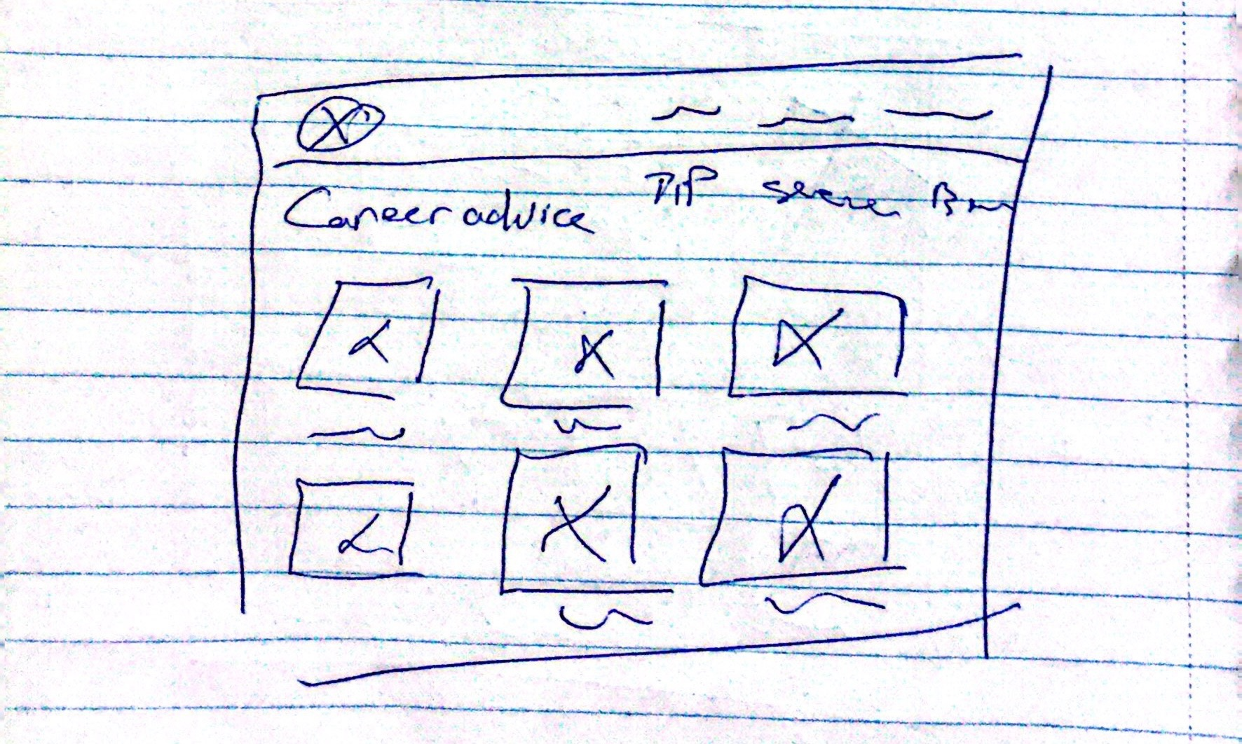
With these questions, I led the team through iterative rounds of design studio sessions to construct a cohesive layout of different pages for our client portal. We started to rapidly sketch out design ideas and during the first round, we realized that we were focusing on different areas of the portal.
Myself: Focused on the layout of the dashboard
Naomi: Focused on the display of the documents
Yashar: Focused on the arrangement of the resource page
After concluding that we need to prioritize the layout of the dashboard, document, communication, and resource pages, we conducted multiple rounds of design studio to finalize the general layouts that we could all feel proud of.
Prioritizing MVPs
MSCW CHART
Once we had a good idea of the features that would help bring our solution statement to life, we utilize a MSCW chart to identify which content was most important to focus on for our project and prioritize the “Must” features.
Ideating the solutions
SOLUTION STATEMENTS
The redesigned iRock Resumes’ client portal will provide users with a streamlined experience while alleviating anxiety around the job searching process by:
Visualizing the problem space
USER JOURNEY MAP
Once we determined our solution, we wanted to bring it to life with a journey map before designing to ensure we were solving all of our users’ problems. Here we meet Executive Ellie during her job search while using our client portal.
Analyzing industry role models
C&C ANALYSIS
Before we brought our sketches to life using Figma, we turned to the market to see how other competitors and comparators were solving these problems. Here are a few key features we drew inspiration from.
General Assembly
Task / document card with title, completion status, and due date.
ClickUp
Calendar feature on the dashboard
TopResume
Resources & Tools page that are sections into different categories (interview, branding, networking, etc.)
Phase Three /
DESIGN
Conceptualizing features into wireframes
WIREFRAMES
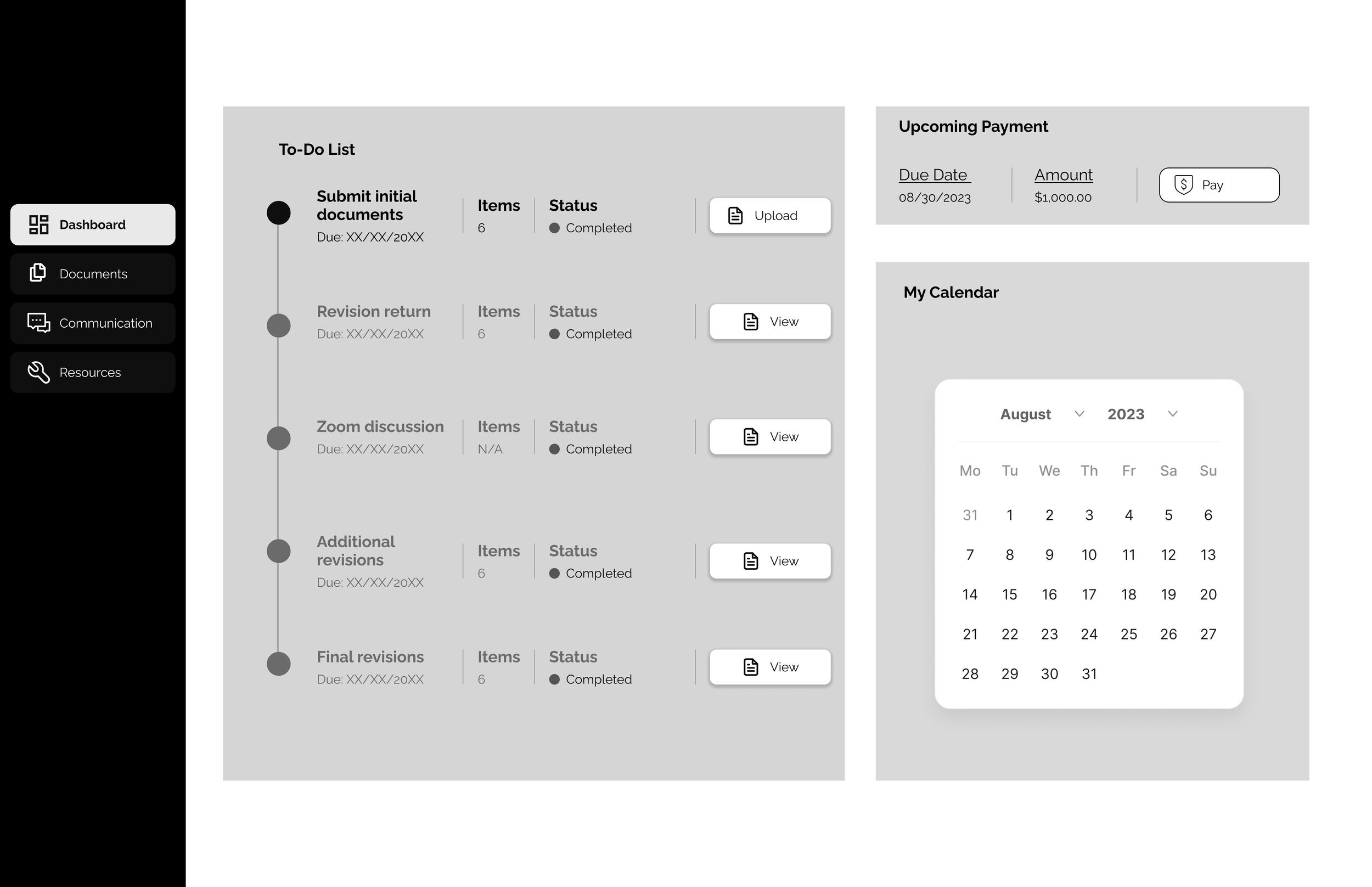
Utilizing our sketches during design studio, I executed those ideas into a couple of low-fidelity wireframes on Figma and clickable prototype for usability testing.
Added a unified dashboard containing the users’ progress and necessary tasks with sidebar that emphasize frequently used categories.
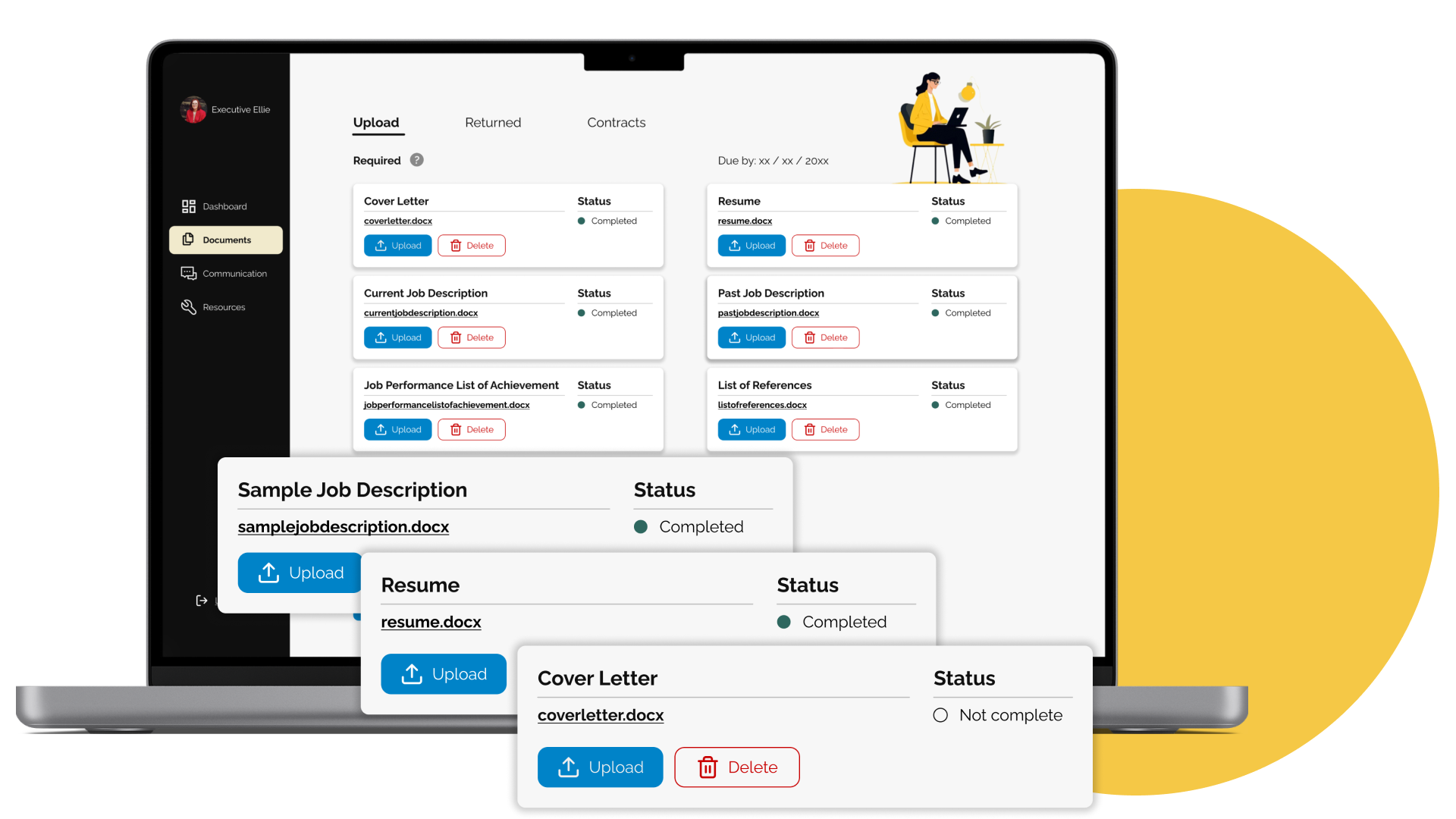
Incorporated a document uploading/ viewing tabs to consolidate their documents to alleviate any other inconvenience and improve productivity.
Provided accessible tools and resources to give users the power to become self-sufficient during their jo search process.
Implemented a messaging feature that allows users to connect and chat with their coach when needed.
Identifying usability issues
USABILITY TESTING
After we had the basic structure for our portal in a low-fidelity prototype, we conducted multiple rounds of usability testing to systematically pinpoint and identify potential red-flags within our redesign. All of our users were able to successfully finish the tasks, however, there were some hiccups within the process.
“Is this mine or my career coach to-do list?”
The name of the task list is confusing because it consists of things both the users have to complete and documents that are returned to them.
“I thought I could upload something when I clicked on the upload button.”
Users were expecting something to pop up so they can choose their documents instead of taking them to another page.
“Is this where I revise my documents?”
Users thought that they can edit their documents within this tab instead of viewing the drafts that were returned to them from Nickquolette.
“I thought I was still on the upload page for a second there.”
The name of the draft in the returned is similar to the name of the upload draft.
“The background makes me feel like I’m using a different portal.”
The inconsistency in the background of the dashboard and document page which makes them feel like they were using different sites.
Phase Four /
DELIVER
Delivering Hi-Fi Prototype
HIGH-FIDELITY PROTOTYPE
Adhering to industries-leading UX/UI practices and methodologies, I developed a high-fidelity user interface and clickable prototype of the redesigned iRock Resumes’ client portal that aligns with both the user and business needs.
What I learned
PROJECT TAKEAWAYS
🔑 Communication is key:
Since this is the first time working with a client, I’ve learned that communication is the key to foster an open and transparent partnership. Therefore, keeping our client up-to-date with the research and design process during milestone meetings is crucial to the overall success of the project.
🚗 Prototyping is a journey of learning:
I learned that sometimes when I’m knee-deep into my designs, it’s hard to take a step back and look at the overall picture, so there are elements that you might miss. Therefore, each iteration of our prototype after each round of usability testing is a chance to learn from our users and transform our users’ insights into an intuitive product experience.


