Redesigning SHEIN
Enhancing User Experience for Fashion E-Commerce
Overview
As retailers shift their marketplace to digital platforms, online shopping has increased exponentially, offering a vast array of products available at the tip of your fingers. The convenience it provides is undeniable; however, seamlessly navigating through these marketplaces can be overwhelming and SHEIN is one of them.
Phase One /
DISCOVER
Identifying the problem
HEURISTIC EVALUATION
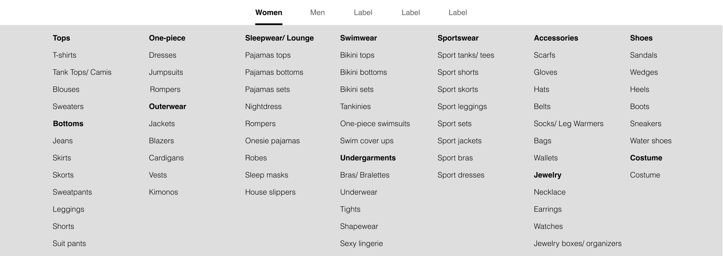
Through navigating the website, I identified multiple instances where SHEIN violated Jakob’s 10 Usability Heuristics principles and could use a redesign to improve user’s experience navigating site. Here’s a laundry list of usability and visual concerns that needs to be addressed:


Validating usability issues
USABILITY TESTING
However, is it just me who’s struggling to navigate the website? To answer the question, I conduct multiple usability tests where I asked a group of users to complete usability tasks in order to identify their struggles navigating the website. The results are that users were
Phase Two /
DEFINE
Visualizing the problem space
USER JOURNEY MAP
Using the user’s feedback from the previous methodology, I constructed a visualization of my user’s thoughts and processes if they were to follow through with their order and completed the checkout process using a journey map.
Synthesizing research
AFFINITY MAPPING
In order to understand the overall problem space, I also interviewed several additional users to gather insights about their overall shopping experience, both in-store and online. With their feedback, I started to organize them on post-it notes, generated an affinity map that reveals the underlying themes, and formulated the “I” statements such as:
I want various selections & styles.
“I like it when they tend to have different things, so it doesn’t feel like I’m wearing the same thing that everyone else is wearing.”
I want a seamless online shopping experience.
“I personally like it if it’s very clean and simple. Just reduces the risk of me going into stress mode.”
I want to be able to find my sizes & measurements.
“I like having the measurement and fit because it’s very helpful, even when you’re guesstimating.”
I want accurate filtering options.
“Just to have things organized in a way that I can search by their categories.”
Empathizing with users
USER PERSONA
Based on these qualitative data, I couldn’t help but ask myself, “What’s the problem that users are experiencing? Why are they experiencing this problem? Who might be experiencing this problem?” Let me introduce you to Sophia, the student.
Name: Sophia, the Student
Age: 28
Status: Full-time
Location: Seattle, Washington
Life: Single
“I would love to explore new style of clothing online but I don’t know if it’s my size.”
Problem Statement:
Sophia is a diligent, frugal, and time-pressed student who is constantly looking for a variety of clothing styles that are affordable and available in her size. However, she finds it overwhelming to do so online with the unprecedented amount of filtering options, obscure size descriptions, and strict return policies. She needs a solution that allows her to explore new styles with ease while getting a seamless shopping experience.
Goals:
Find new styles of clothing that she likes and is available in her size
Able to purchase at an affordable price
Fast & smooth online experience
Frustrations:
Unable to try on clothes prior to purchase
Strict return terms & policies
Overwhelmed with all the categories & filtering options
Obscure & unreliable size descriptions.
Brainstorming potential solutions
“HOW MIGHT WE…” STATEMENTS
To address the problem that Sophia is experiencing, let’s generate some “How Might We…” statements to explore different ideas or potential solutions.
Analyzing industry role models
C&C ANALYSIS
Before synthesizing potential solutions to our problem, I conducted market research to compile a feature-centric C&C analysis that rigorously analyzes a few industry “role models” that has been solving, or trying to solve, the problem. During this analysis, I set out to understand the key component that they cleverly implemented which contributed to their overall success.
Old Navy:
Reduces the amount of provided filters
Restrains how many filters users can open simultaneously.
ASOS:
Includes the sizes of what the model is wearing
Includes a detailed size guide, size conversion, and how to get those measurements to guesstimate their sizes
Amazon:
Displays ratings underneath the listed items
Implements the review as part of the search filter
Forever 21
Clean interface
None of the elements compete with one another
Categories are introduced by a dropdown menu
Global navigation is distinct from the local navigation
A prominent search bar
Ideating the solutions
SOLUTION STATEMENT
SHEIN, recognized as one of the world’s prominent clothing websites, is committed to offering affordable pricing and establishing customers’ trust. With their redesigned website, users can confidently and quickly navigate and search for items while being on the lookout for affordable new styles by…
Phase Three /
DESIGN
Sketching out ideas
SKETCHING
At this point, I started to rapidly generate all my ideas by sketching low-fidelity wireframes that encompasses all the solutions listed above.
Ideating low-fidelity wireframes
WIREFRAMES
Using these sketches, I quickly executed those ideas into a couple of low-fidelity wireframes using Figma.
Leveraging visual hierarchy that emphasizes frequently utilized categories and deliberate organization of products
Clean interface with a very prominent search bar as part of the global navigation to give user the freedom to search for the product.
Limited essential filtering options to attenuate users' choice paralysis
Displays products reviews and ratings underneath the items
Users have access to view/edit their cart during the checkout process.
Clearly defined size descriptions and return policies listed next to products to instill users’ confidence and trust.
Identifying usability issues
USABILITY TESTING
After converting the low-fidelity wireframes into a mid-fidelity prototype, I started another round of usability testing. The core purpose of this usability test is to determine if users are still experiencing the same issues with the redesign. User feedback is crucial during the early phase of the design process since they aid designers in locating potential red flags that needs to be adjusted and edited prior to handing the “blueprint” to front-end developers.
All of my users were able to complete the assigned task, however, there were hiccups along the way such as,
Checkbox vs. Radio
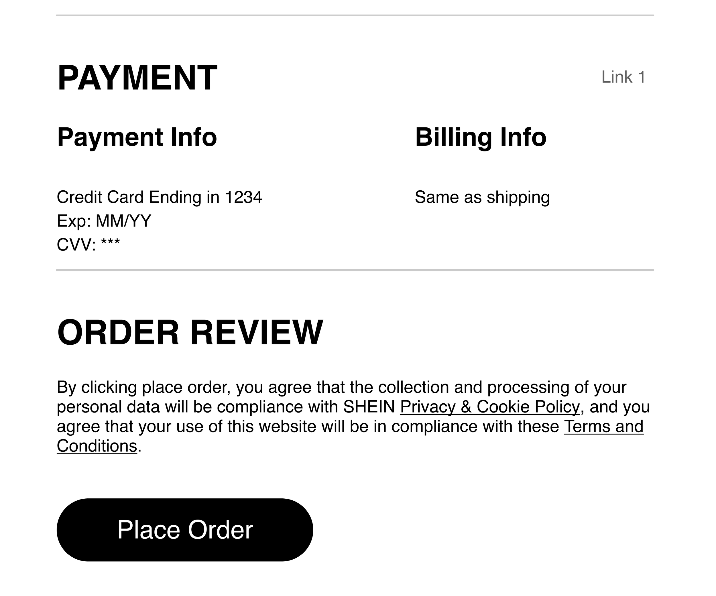
Users were confused when the checkboxes were utilized to select the payment option. Checkboxes allow user to select more than one option whereas, radios limit users to choose only one option, which is more relevant when selecting a payment option.
“They look like buttons”
The “Average Rating” and “Did they fit well?” look like clickable buttons due to a similar element being used as a button in the previous wireframes.
Order Review
Users expect this to be the first step of the checkout process instead of the last because they were expecting a summary of their entire cart.
Phase Four /
DELIVER
Delivering Hi-Fi Prototype
HIGH-FIDELITY PROTOTYPE
Implementing UI best practices, I created a high-fidelity clickable prototype of the redesigned SHEIN that showcase all the micro-interactions.
What I learned
PROJECT TAKEAWAYS
⏰ Time Management:
I love Figma. I’m always learning new ways to construct better wireframes and prototypes which takes time away from other deliverables such as presentation and conducting more rounds of usability testing. Going forward, I want to implement time blocking and setting reasonable deadlines for certain deliverables in order to complete the project thoroughly.
😱 Stress Management:
As the lead UX researcher and designer who oversaw the entire project, I was stressed and overwhelmed at times. The stress did take a toll on me where I started to second-guess my decisions and choices. Going forward, I want to block out time to take a step back and do something fun, like calling a family member/friend, take a walk outside, etc. to decompress in order to have a healthy balance of work and personal life.


